This project started with a common spreadsheet problem.
The business was tracking operations week by week. Each week had its own Google Sheets tab, and each weekly sheet contained a mix of income, expenses, labor, jobs, and operational notes.
That setup worked for basic data entry, but it was not built for reporting.
The goal of the restructure was to save time, reduce repetitive spreadsheet work, and make the data safer to maintain. Instead of copying the same types of records across weekly tabs, the business needed a cleaner system where entries could be captured once, stored in the right table, and reused for reporting.
That also helped reduce the risk of missed or lost data. When information is scattered across many weekly sheets, it is easier for rows to be skipped, formulas to break, or important details to be left behind during manual updates.
When the business needed to understand monthly revenue, labor cost, expenses, net profit, client activity, or job performance, the data had to be pulled together manually. The information existed, but it was scattered across weekly tabs in a format that made analysis slower than it needed to be.
Before building a dashboard, the first job was to fix the structure.
The Starting Point: One Sheet Per Week
The original workflow was simple:
- Create a new sheet for each week from a template.
- Enter job income, labor, and expenses in that weekly sheet.
- Use the sheet as both a record-keeping tool and a reporting source.
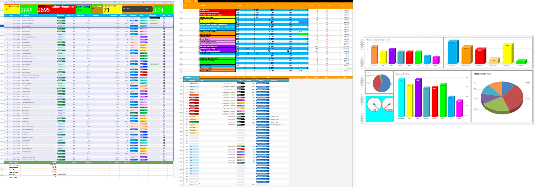
This is a very normal way for a growing service business to start. It is easy to understand, easy to update, and flexible when the business is still figuring out its process.
The problem appears later, when the same spreadsheet needs to answer bigger questions:
- How much revenue did we make this month?
- Which weeks had the highest labor cost?
- Are actual labor expenses higher than expected?
- Which teams are driving the most revenue?
- How many active clients do we have?
- Which expense categories are growing?
- Can this data feed a dashboard without manual cleanup?
Weekly sheets are good for entering weekly information. They are not ideal as a long-term reporting database once the business needs monthly reporting, automation, and dashboards.
Why the Data Needed to Be Restructured
The main issue was not that the spreadsheet was "bad." It was that the spreadsheet had outgrown its original purpose.
The weekly layout made it difficult to compare periods, group records, and connect the data to a dashboard. Because income, expenses, and labor were mixed together, every report needed extra cleanup before it could be trusted.
The new structure needed to support three goals:
- Make the data easier to enter consistently.
- Make the data easier to analyze by month, week, team, client, and category.
- Make the data reliable enough to connect to Looker Studio later.
Step 1: Separate the Data by Type
The first restructuring decision was to stop treating each week as its own mini-report.
Instead, the spreadsheet was reorganized into separate tables for the main business entities:
- Jobs
- Labor
- Other expenses
- Clients
- Dates
- Totals
This changed the spreadsheet from a collection of weekly tabs into a lightweight database.
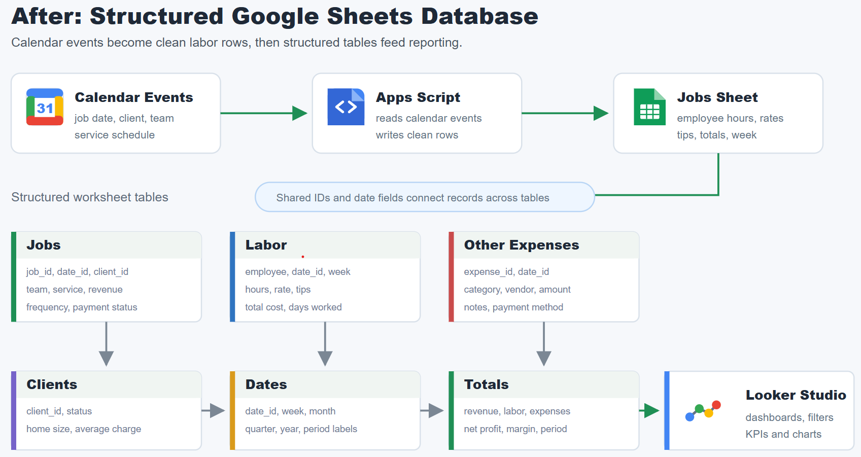
Each table had one job:
- The jobs table tracked job-level revenue and operational details.
- The labor table tracked employee hours, rates, tips, totals, days worked, and weeks worked.
- The expenses table tracked non-labor expenses by category and date.
- The clients table tracked customer status and basic client attributes.
- The dates table helped standardize reporting by week, month, and year.
- The totals table supported summary reporting and dashboard calculations.
This structure made the data easier to filter, group, and connect to reporting tools.
Step 2: Migrate the Historical Data
Before automating new entries, the existing historical data also needed to be moved into the new structure.
The old weekly sheets already contained valuable records, so the goal was not to start over. I used scripts to migrate the existing weekly data into the new tables, separating jobs, labor, expenses, and totals into their correct destinations.
That migration step was important because the new reporting system needed history. Without the old data, the dashboard would only show future activity. By moving the existing weekly records into the new structure, the business could compare periods, review previous months, and keep continuity across the reporting system.
The migration also helped clean up the workflow. Instead of manually copying records from every old weekly sheet, scripts handled the repeated extraction and transfer work more consistently.
Step 3: Standardize the Columns
Once the data was separated by type, the next step was to standardize the columns.
This matters because dashboards and formulas depend on consistency. If one sheet uses a date, another uses a week label, and another stores the same value as text, the reporting layer becomes harder to trust.
The new structure used consistent fields for dates, weeks, months, categories, teams, clients, and financial values. Numbers were kept as numbers, dates were kept as dates, and fields that needed to be filtered later were given their own columns.
For example, the labor data was organized around employee names, days worked, hours, rates, tips, totals, weeks, and months. That made it possible to analyze labor cost by person, week, month, or reporting period without manually rebuilding the data each time.
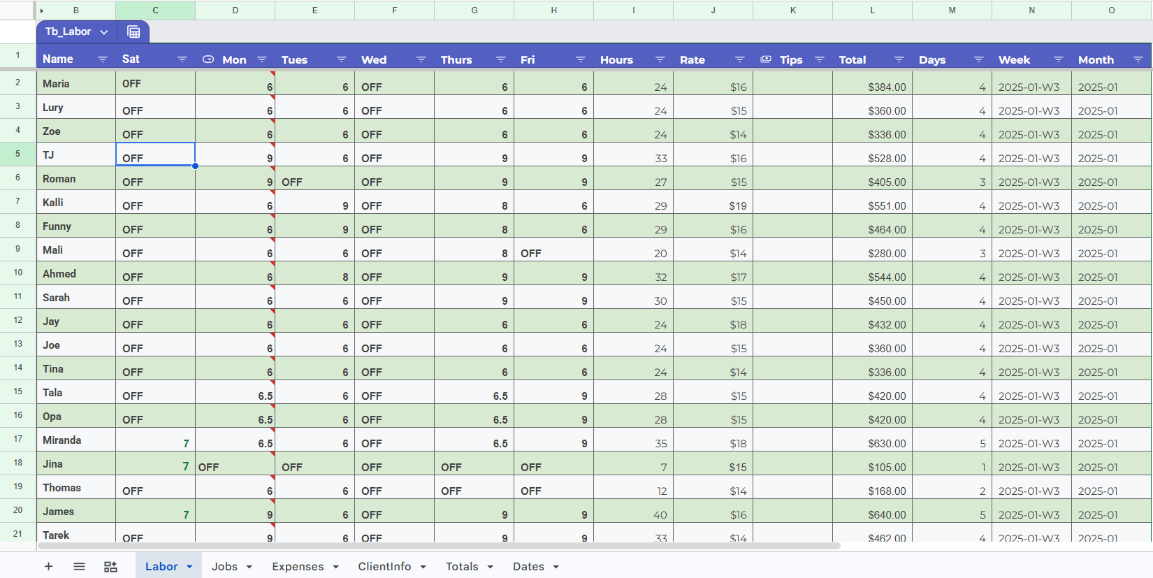
I also avoided using the weekly sheets as both the entry form and the reporting table. The cleaner structure separated raw records from summary calculations, which made the whole spreadsheet easier to maintain.
Step 4: Automate Calendar Events Into Sheets
After the historical data was migrated and the tables were standardized, the next step was to reduce future manual entry.
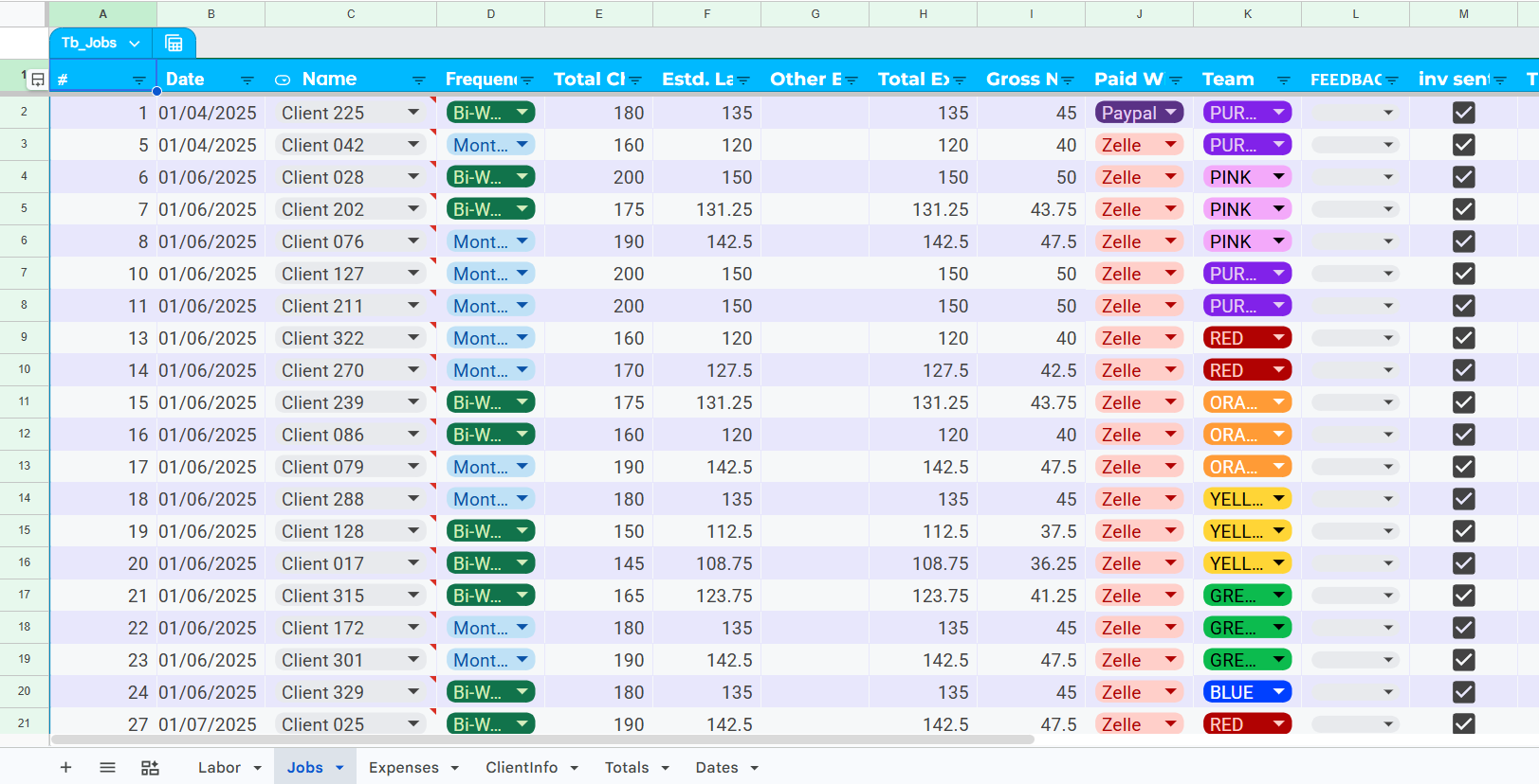
The business already had job information in a calendar. Instead of manually copying those scheduled jobs into Google Sheets, I used Apps Script to move calendar event data into the Jobs sheet.
Calendar events became a source for job entries. The script helped create consistent rows in the Jobs table, using the calendar as the source of scheduled work and the spreadsheet as the structured reporting database.
This reduced repetitive copying and helped protect the workflow from missed entries. When a process depends on someone copying calendar details into a sheet by hand, it is easy for one job to be skipped or entered differently from the others. Automation made that part of the workflow more consistent.
Step 5: Prepare the Data for Dashboarding
The final structure was designed with reporting in mind.
Looker Studio works best when the source data is tabular and consistent. The restructure made it possible to filter by year, month, week, team, category, and client status. It also gave the dashboard clean fields for revenue, estimated labor expense, actual labor expense, other expenses, total expense, and net profit.
This was the main reason the data cleanup came before the dashboard. A dashboard can only be as useful as the structure behind it. If the source data is scattered across many weekly tabs, the dashboard becomes fragile. If the source data is organized into clean tables, the dashboard becomes easier to build and easier to maintain.
The Result
The final system turned a manual weekly spreadsheet process into a cleaner operations database. The business could continue using Google Sheets, but the data was now structured in a way that supported automation, reporting, and dashboard analysis.
The Totals sheet became the reporting layer inside Google Sheets. Instead of manually checking each weekly tab, the business could review weekly and monthly totals for revenue, estimated labor expense, actual labor expense, other expenses, total expense, net profit, and unpaid amounts.
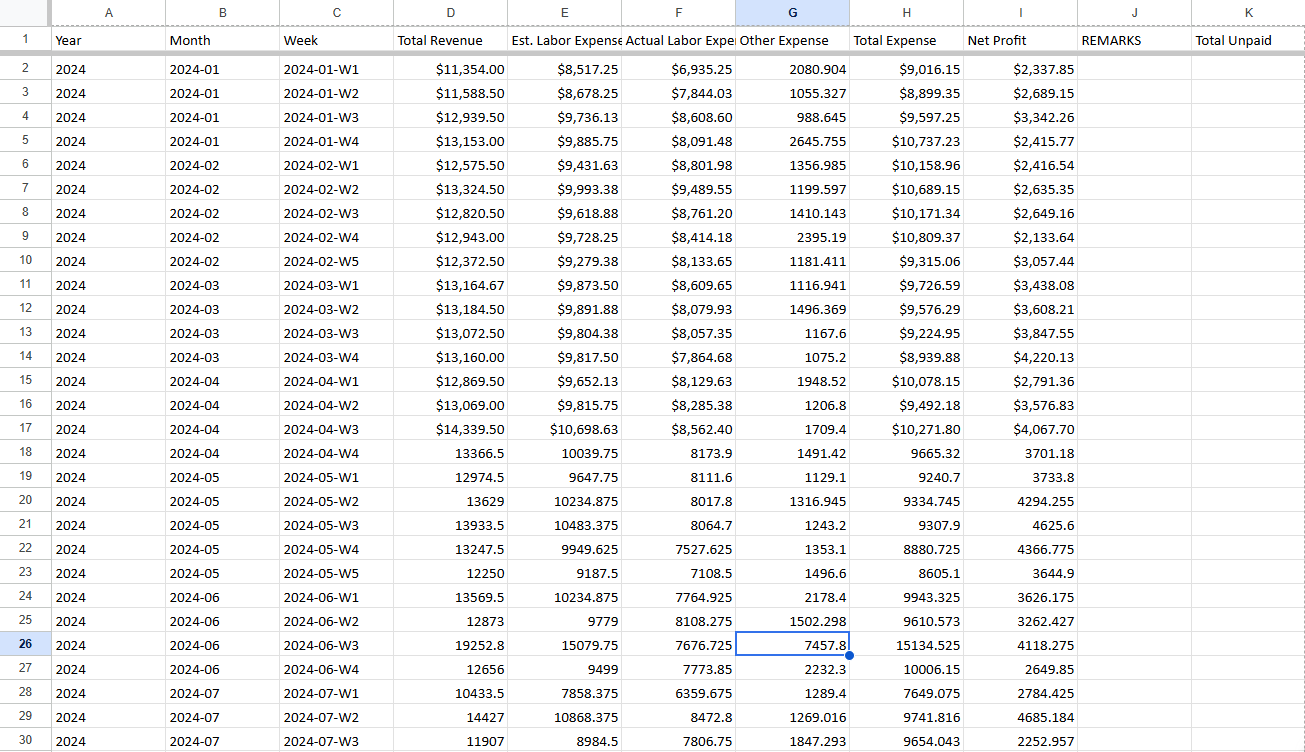
This also made the Looker Studio dashboard easier to build because the main reporting fields were already standardized before the data reached the dashboard. The dashboard became the visual layer, but the real foundation was the Google Sheets database underneath it.
The project delivered three practical improvements:
- Old weekly records were migrated into a cleaner structure.
- New calendar events could be added to the Jobs sheet with less manual work.
- Reporting became easier because totals, dates, jobs, labor, expenses, and clients were organized into separate tables.
Key Takeaway
The most important lesson from this project is that dashboard quality depends on data structure.
A good dashboard does not start with charts. It starts with clean tables, consistent fields, and a workflow that makes future data easier to maintain.
For small businesses, Google Sheets can still be a strong reporting system when it is structured properly. The key is to stop treating every weekly tab as a separate report and start treating the spreadsheet as a lightweight database.
Need a Similar Google Sheets Automation?
If your business is still running on weekly tabs, copied calendar entries, or manual spreadsheet reports, I can help restructure the data and build a cleaner automation workflow around it.