What I Built
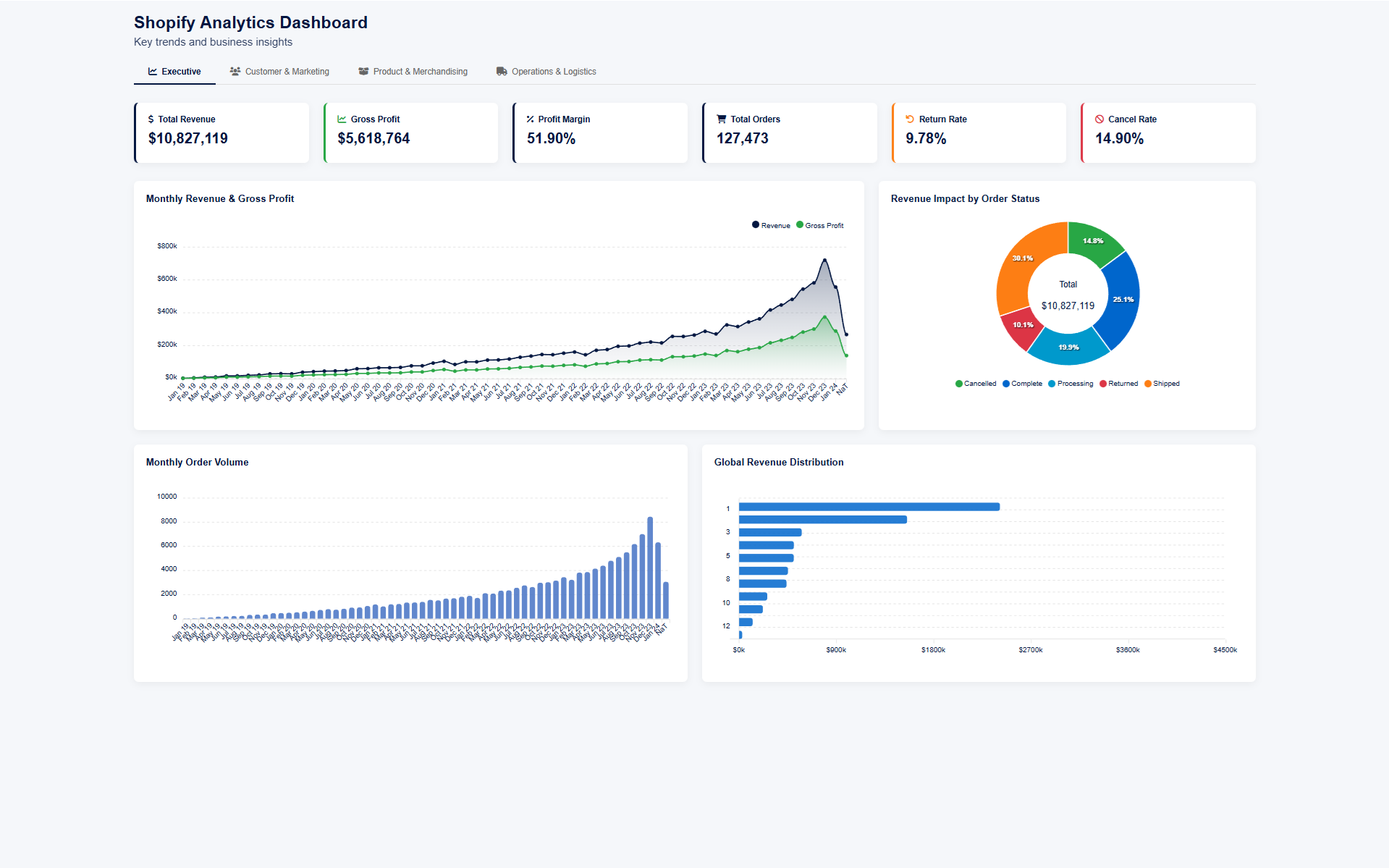
Executive Overview
High-level KPIs for leadership: total revenue ($10.8M), gross profit, profit margin (51.9%), total orders (127K), return rate, and cancel rate. Includes monthly revenue trends, revenue breakdown by order status, monthly order volume, and global revenue distribution.
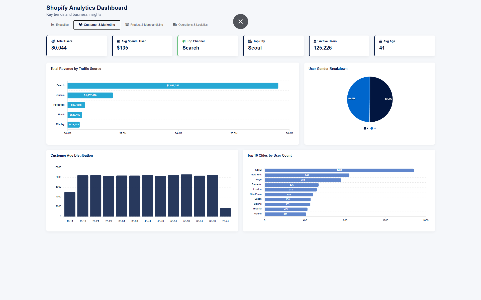
Customer & Marketing
Customer analytics: 80K total users, $135 avg spend, top traffic sources (Search at $7.6M), gender breakdown, age distribution, and top 10 cities by user count. Helps the marketing team understand who their customers are and where revenue comes from.
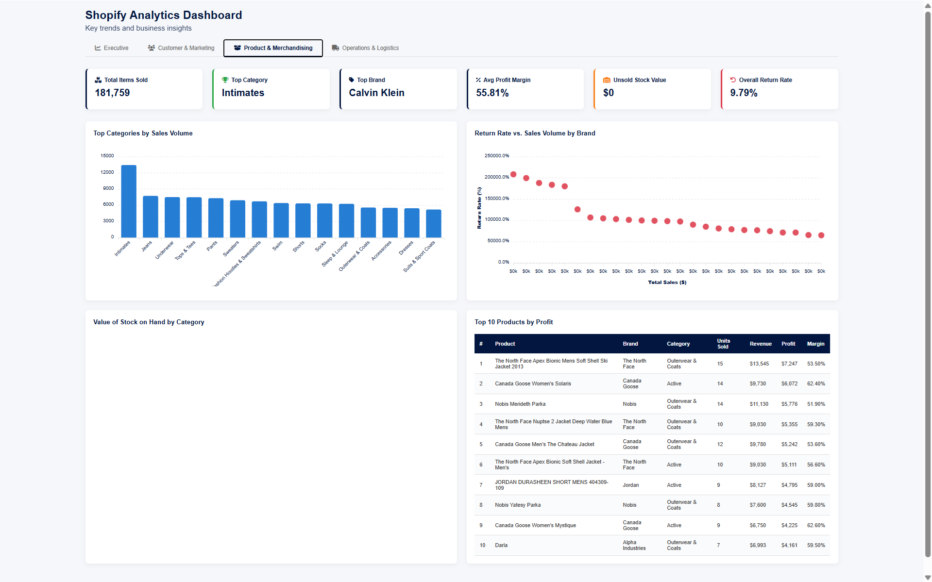
Product & Merchandising
Product performance: top categories by sales volume, return rate vs. sales volume by brand (scatter analysis), stock on hand by category, and top 15 products ranked by profit. Gives the merchandising team data to make buying and stocking decisions.
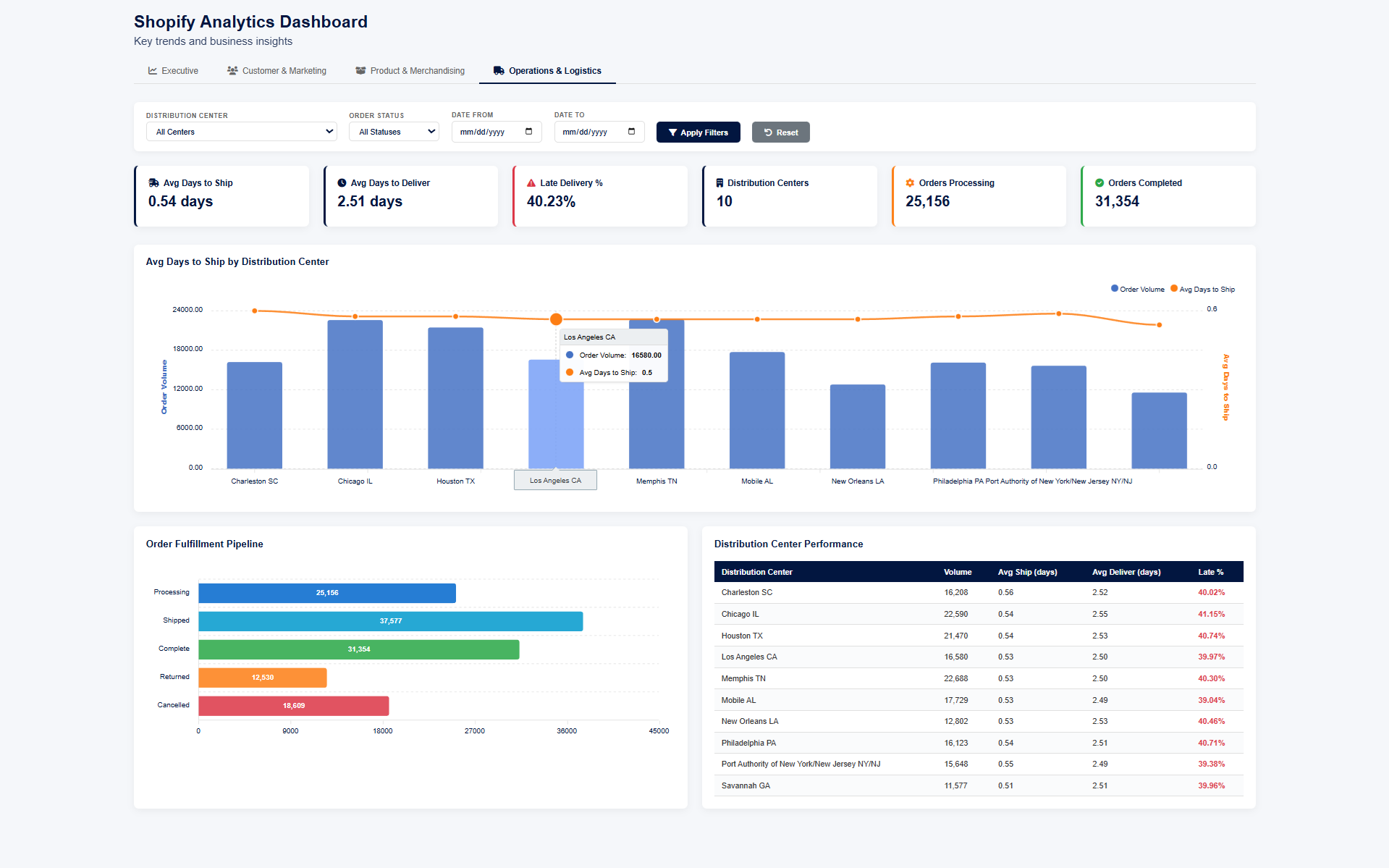
Operations & Logistics
Operational KPIs: avg days to ship (0.54), avg days to deliver (2.51), late delivery rate (40.23%), order fulfillment pipeline, and distribution center performance table with volume, ship times, and late percentages per center. Includes interactive filters for distribution center, order status, and date range.
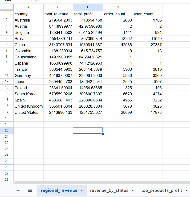
Data Layer — Aggregation in Google Sheets
All dashboard data is powered by structured aggregation tables in Google Sheets. Regional revenue, total profit, order counts, and user counts — all pre-computed so the dashboard loads fast and stays accurate.