This project turned a cleaning business reporting workflow into a clear financial and operations dashboard.
The business needed more than a spreadsheet full of weekly records. It needed a way to see revenue, labor cost, other expenses, net profit, client activity, and team performance without manually rebuilding reports every month.
I built a Looker Studio dashboard on top of a structured Google Sheets database. The result was a reporting system that lets the business review financial health, spot labor cost pressure, compare teams, profile clients, and track operating expenses from one dashboard.
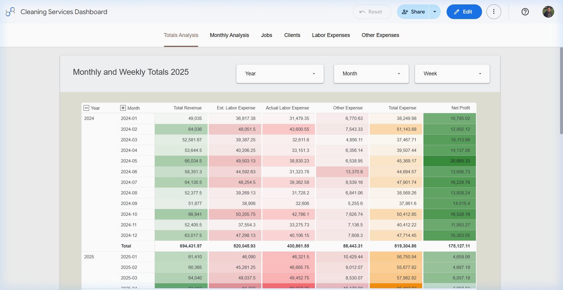
Dashboard Snapshot
The dashboard was built for a real service business with recurring jobs, team-based work, labor costs, client segments, and expense categories. The goal was to make the data easier to review at the owner and operations level.
The Problem
The business had operational data, but the data was not easy to analyze. Revenue, labor, jobs, expenses, and client details needed to be reviewed together, not one sheet at a time.
The dashboard needed to answer practical business questions:
- How much revenue did the business generate by month and week?
- How much of that revenue was being absorbed by labor expense?
- Which months had net profit pressure?
- Which teams were producing the most revenue?
- How many clients were active, occasional, inactive, or referral-related?
- Which employees had the highest hours, rates, tips, and total labor cost?
- Which non-labor expense categories were driving overhead?
The Solution
The solution was a Looker Studio dashboard connected to clean Google Sheets tables. The data structure was handled in Google Sheets, while Looker Studio provided the visual layer for filtering, analysis, and reporting.
The dashboard includes views for:
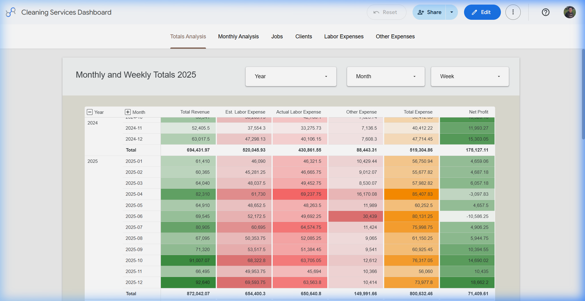
- Monthly and weekly financial totals
- Revenue, estimated labor, actual labor, expenses, and net profit
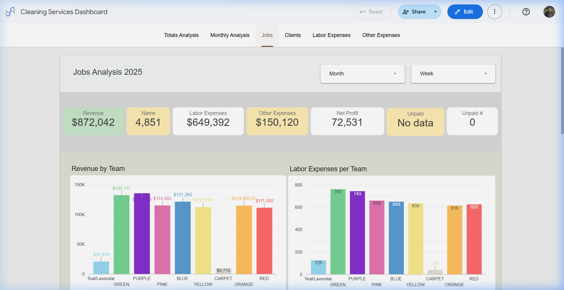
- Revenue and labor by team
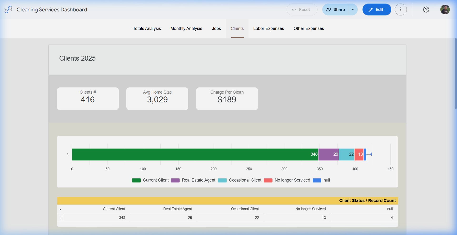
- Client segmentation and average charge analysis
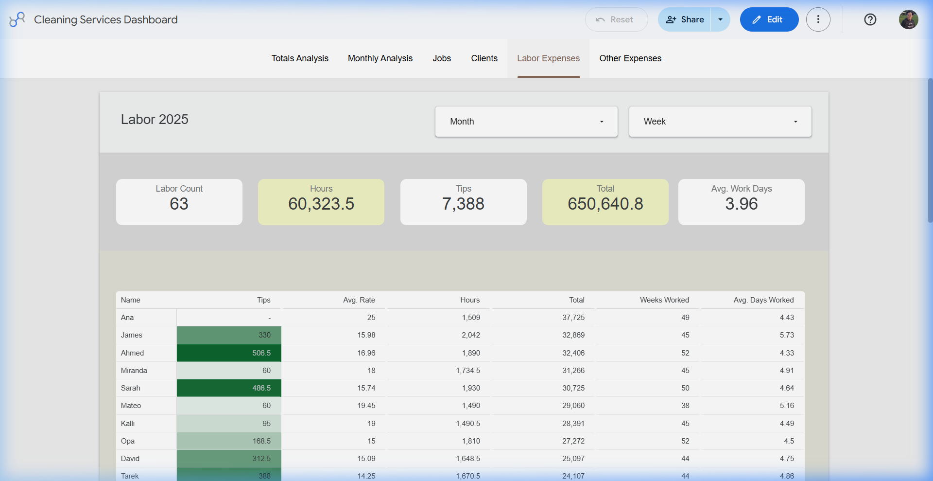
- Employee-level labor economics
- Other expense analysis by name and category
The data restructuring work behind this dashboard is covered separately in the blog post: Restructuring a Google Sheets Database and Automating Calendar Events Into Sheets.
Weekly Reporting Flexibility
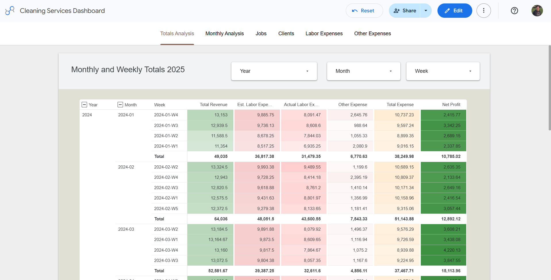
One important requirement was flexibility. The business may need a yearly view for strategic review, a monthly view for management, and a weekly view when a client request or operational question needs a faster answer.
The dashboard supports that by allowing the same structured data to be reviewed through weekly totals and weekly analysis views. This makes the report useful for both high-level financial review and detailed follow-up.
Visual Gallery
Each dashboard tab was designed around a different business question.
Totals Analysis
Monthly and weekly financial matrix for revenue, estimated labor, actual labor, other expenses, total expenses, and net profit.
Monthly Analysis
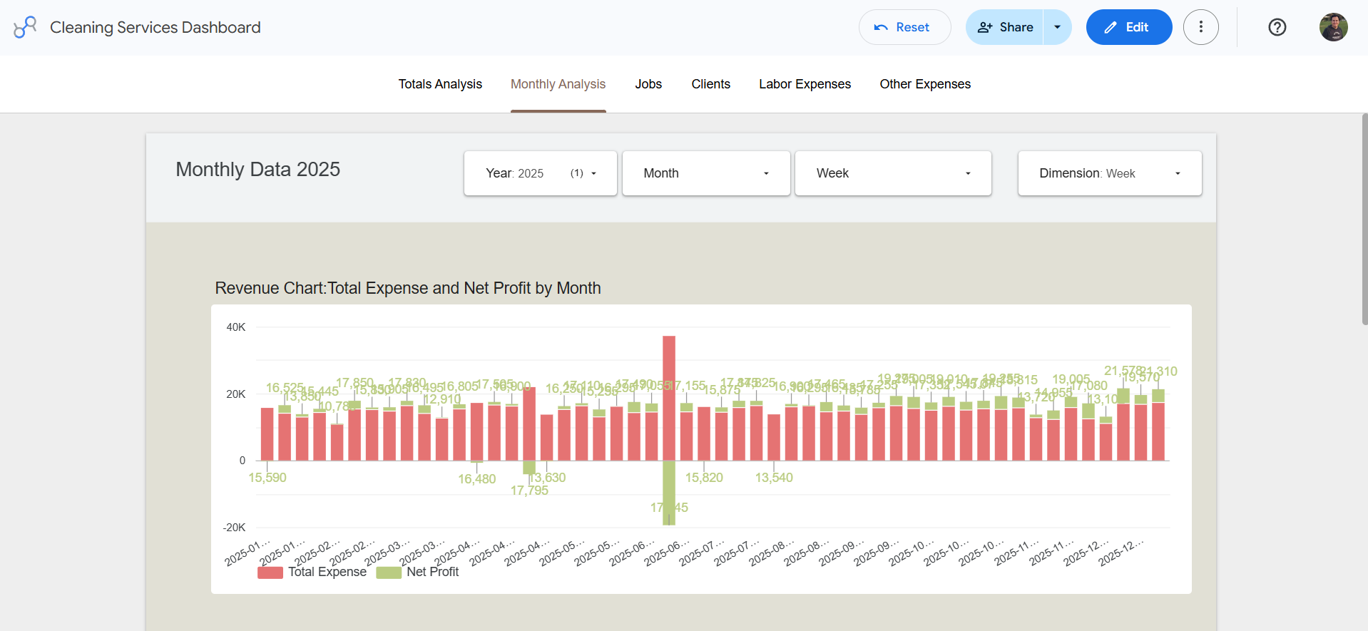
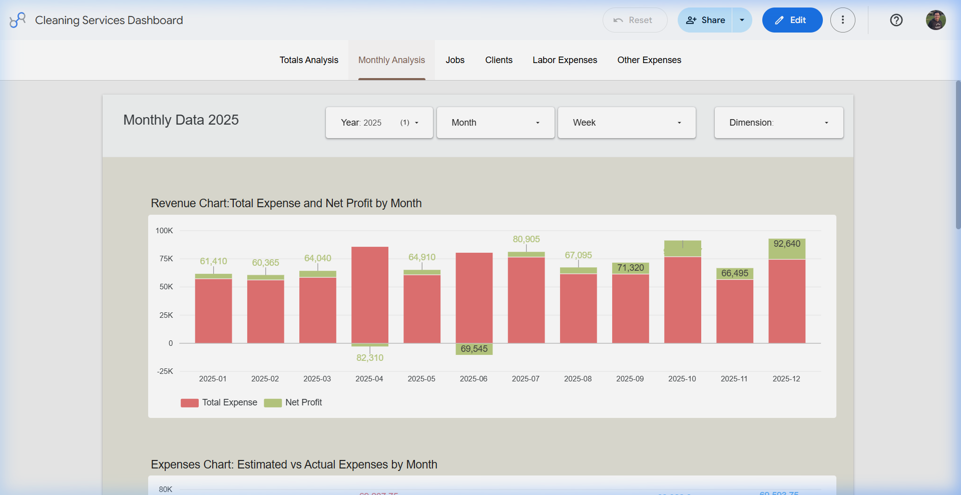
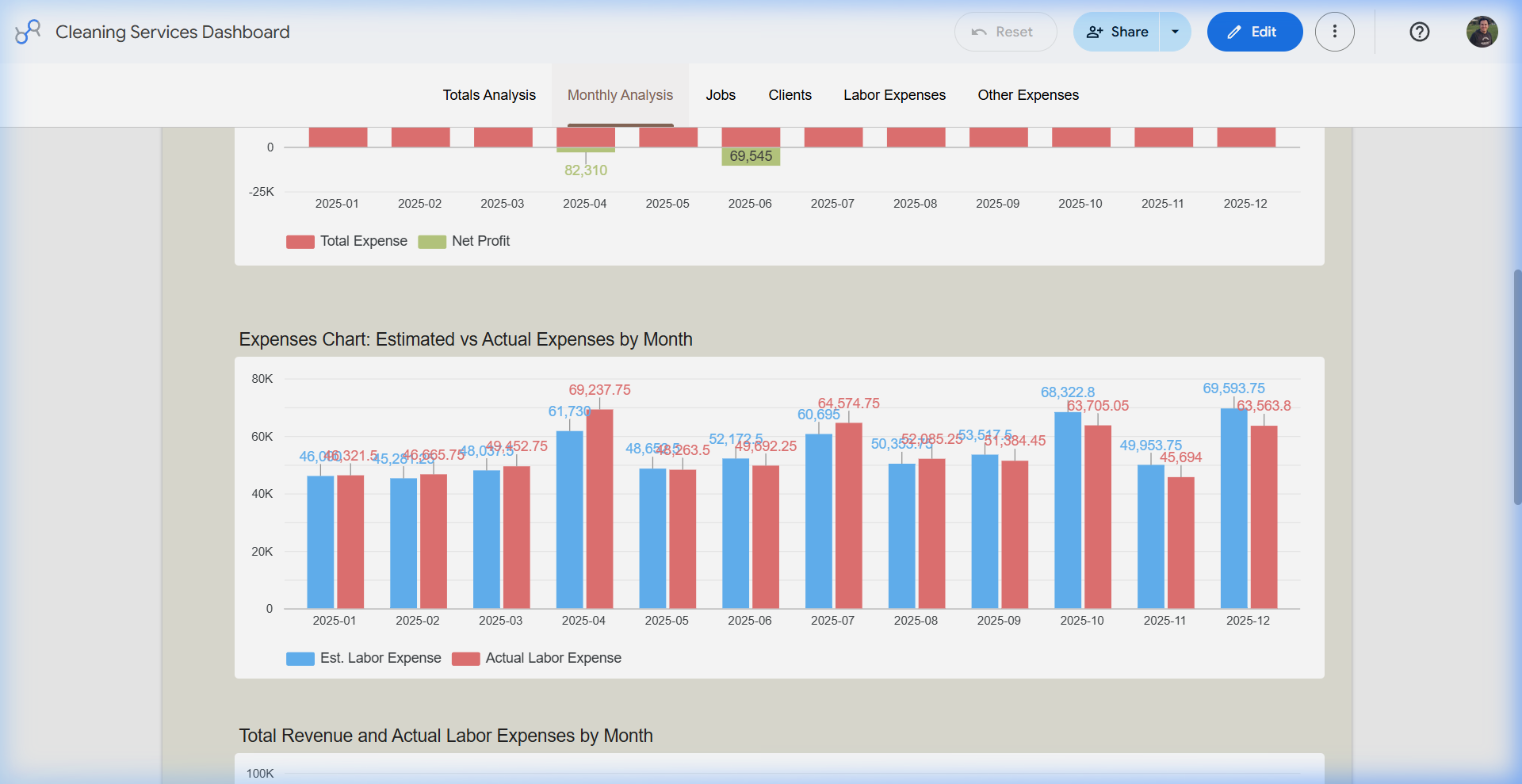
Visual comparison of monthly expenses, labor cost, revenue, and net profit to spot margin pressure.
Jobs and Team Performance
Team-level revenue and labor expense views for comparing operational performance across service teams.
Client Profiling
Client count, average home size, average charge per clean, and active account segmentation.
Labor Economics
Employee-level audit of hours, rates, tips, weeks worked, average days worked, and total labor cost.
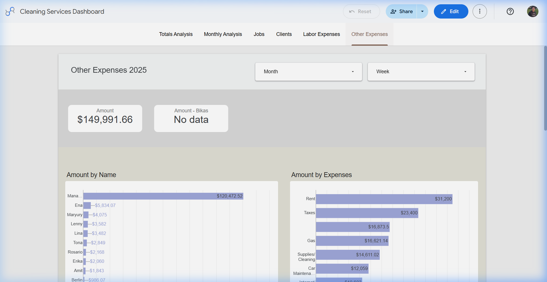
Other Expenses
Expense analysis by person, vendor, and category to understand non-labor operating costs.
Monthly Profit Pressure
The Monthly Analysis view makes it easier to see where profitability changes. Instead of reviewing numbers row by row, the owner can compare total revenue against actual labor expenses and net profit across the year.

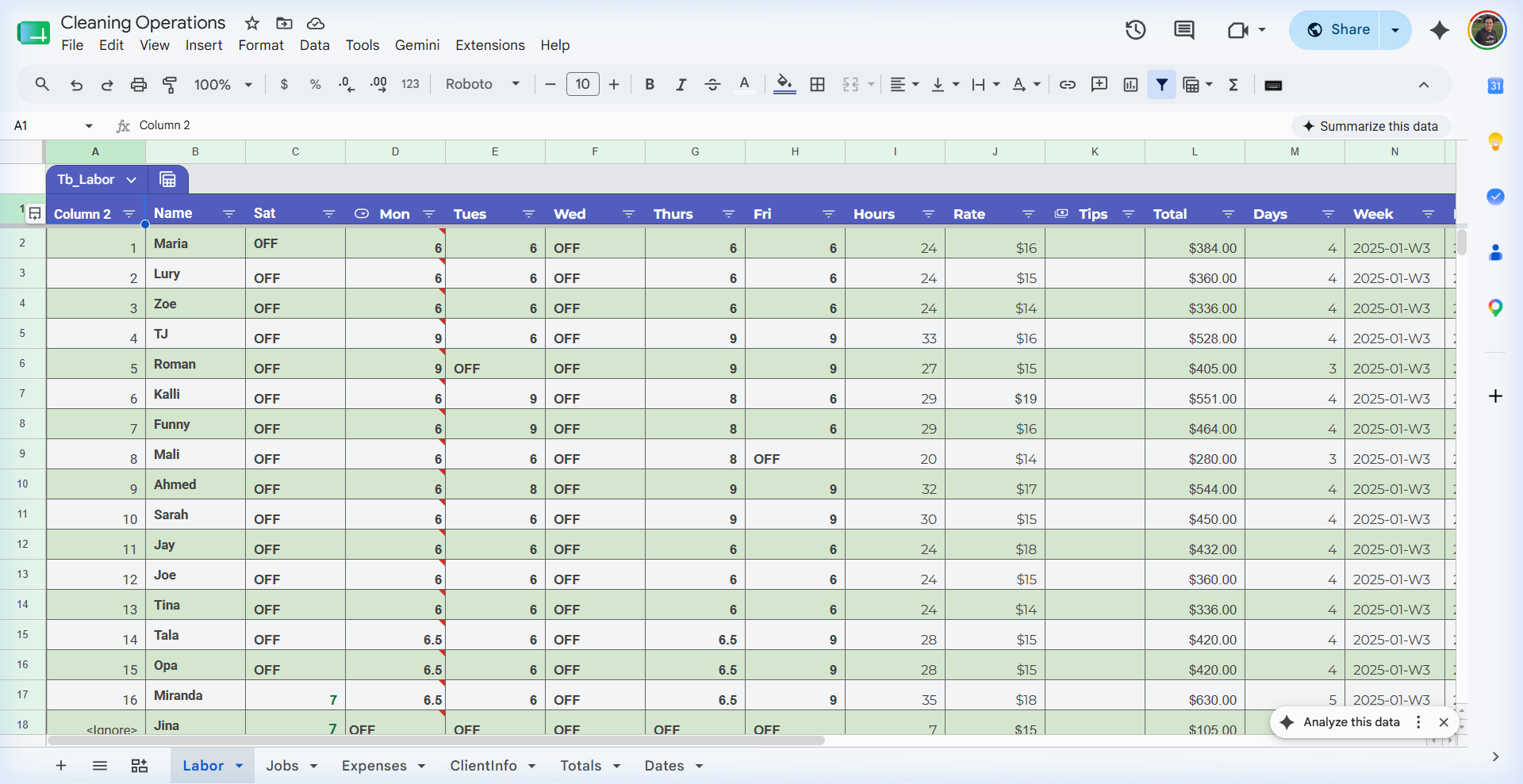
The Data Engine: Google Sheets
The dashboard was powered by a structured Google Sheets database. That kept the system practical for the business while still supporting dashboard-level reporting.
The Sheets database included structured tables for jobs, labor, expenses, client information, totals, and dates. This made the Looker Studio dashboard more reliable because each chart was connected to a consistent source table.
Tools and Deliverables
- Looker Studio: dashboard tabs, scorecards, filters, charts, and reporting layout.
- Google Sheets: structured data source for jobs, labor, expenses, clients, totals, and dates.
- Calculated fields: revenue, estimated labor, actual labor, total expenses, net profit, and operating metrics.
- Dashboard UX: separate tabs for finance, monthly trends, jobs, clients, labor, and expenses.
The Result
The business gained a clearer way to review operations and financial performance. Instead of digging through weekly spreadsheets, the owner can use the dashboard to review monthly totals, labor pressure, expense categories, client segments, and team performance.
The most important outcome was not the charts themselves. It was the ability to turn routine operational data into a repeatable reporting system that could support better business decisions.